
markon e-magazine
Summary


A group of seniors wanted to provide a parting gift because we understand there are challenges faced in University. Additionally, as aspiring marketers, we all entered University with a lot of misconceptions about Marketing, which we only found out later on. Not wanting our juniors to repeat the same mistakes, we shared our experiences through an e-magazine.
role
Co-Creator and Designer (e-Magazine and Website)
timeline
(3 months) Feb - Apr 2020:
Reach out to interested parties and articles collection(2 weeks) May 2020:
Editing of content, designing of collaterals and e-magazine

before we continue…
we got featured in social space magazine 💫
what is markon?

how markon idea was formed • linkedin
Coined from co-creator, Daniel, who decided on the name (Marketing + Konnect), markon is an e-magazine of things we seniors wished our juniors would’ve known so they don’t make the same mistakes we did. It is like a parting gift from the seniors.
origins of markon
A bit of context about myself, I have been a passionate aspiring marketer, prioritising learning about the various roles of marketing over everything else. I was invited to share my experiences by my school’s Marketing Society (SMARKETING) and through that, I met some like-minded individuals. The original idea was actually by Cheryl and Lydia but executed by Daniel and I (and this is the first project I’ve worked with Daniel on)!
We realised (only much later) that we had to be more vocal 📣, we had to shift our mindset 🧠and to be bolder in order to maximise our learning.
Even if one does not know what to do in life, at least knowing there’s resources, people or mentors to ask, makes a HUGE difference!
By the time we utilised our knowledge, it’s time to enter the workforce. Wanting to highlight this early, we decided on an evergreen method: e-Magazine. 📖

The two sections and initial category planning
sections
We have two main sections:
Navigating Through University 🎓
A Deep Dive into Marketing 🛍
Section 01: Navigating Through University 🎓
Some of us have mentored juniors and realised most of the time, freshmen that just entered University have no idea what it is they want to pursue, or what it is they like to do 😱. As such, we have section 01 to provide a more generic overview and highlight on the mindset to have. We even have one that dispels the negative connotation of graduating later than your peers (such as myself! 😜)
Section 02: A Deep Dive into Marketing 🛍
This was the main content we wanted to create. In the initial phase, Daniel and I had troubles thinking of how we wanted to go about grouping the different ‘types’ of Marketing. Even when we googled, answers we got were not satisfactory due a A LOT of overlap. In the end, we thought of a few main marketing roles we thought were not as known (such as Trade Marketing) to undergraduates and got our list!
articles & contributors

Our contributors! • Learn more
Understanding we will be having a few articles, we wanted to ensure that our readers will not be drowning in information, and set a limit of 500 to 700 words maximum per article, getting only what’s essential. ✍️
Daniel and I reached out to almost 30 batch mates with the relevant experiences that we feel would provide a more specialised insight to the readers. Daniel and I tried to reach out to professionals to contribute with the intention to provide insights that we as undergraduates might have missed out. We are thankful to have Rena (Tan) Ling onboard!
Mentioned at the start (and in markon’s name itself), we wanted to make sure we had contributors who are willing to be mentors and guide the juniors or anyone interested. Some of us have seen the importance of knowing the right people, and how it can help with exponential growth.


(Left to right) pages with five and four column layouts. images taken from magazinedesigning.com
designing for mobile 📱
Despite designing it during the COVID-19 period, we understand for now that most would be on their Desktops 💻. However, the timeline we were planning to launch was post Circuit Breaker* period, to coincide with the bidding period** for the local Universities. Hence, we aimed to design the e-Magazine that can be read easily on Mobile📱.
Wanting to mimic a ‘magazine’, I experimented with columns and even wrap-text. There are multiple ways to even go about designing the pages from one to five columns. MagazineDesigning.com sums it up beautifully.
Understanding I had to design for mobile, I had to think of the readers’ eye direction. Unlike an actual magazine, our readers will not be able to see the full two-page spread. Instead, they will potentially only see the first page (whereas for smaller phones, they might only see three-quarters of the page).
*Circuit Breaker is Singapore’s local terminology for a soft-lockdown.
**Bidding period is when students can use e-money provided by their schools to ‘bid’ for their favourite lessons
Thus, these are the main considerations I had when designing the e-magazine:
Two columns only – This is to ensure easier readability on mobile in which users are able to zoom-in the read the content. Although the same can be done for three or more columns, it is best to reduce work done by the reader themselves. Having one more column means users have to utilise more steps to zoom-in and out. One column was out of the question because it would not be as digestible (facing a wall of text 🤢)
Title is always right at the top – Readers will be reading it from top to bottom. To reduce confusion, title is always within the first-quarter of the first page.
There is enough spacing between hyperlinks – Especially for the content page, this ensures readers with ‘fat thumbs’ 👍will still be able to have a great reading experience!

colour choice

with the muted palette (left), it provides a very chill vibe, similar to something you might find in a hipster café or an art house. The bright palette (right) conveys joy and dynamic.
This was very important because it sets the mood and is key to conveying the right amount of energy! I personally have envisioned it to be a chill e-magazine (and nothing too serious). I played around during the initial stages before settling down on the final colour scheme (the one on the right).
I ensured that the base colour was off-white ⚪because anything else might be distracting (if it’s too bright) or even hard for reading (if it’s dark like black). The accents chosen were similar to the primary colours, with a little more yellow, and brighter because we want to convey joy 🎆!
Additionally, it’s more eye-catching should we post on LinkedIn (which is our primary form of distribution).
INDICATION
As seen from sections, the two sections are colour-coded 💛💙 to clearly show the difference. It is actually subtly reflected in the footer of the pages, mentioning the different sections.
Additionally, on the content page, legends were added to simplify what core attributes are required for the various types of marketing. This is to dispel the misconception that you have to be great at art to be a marketer.


use of graphics
Throughout this project, my best friend was freepik.com! I didn’t have the expertise to do illustrations at a quick pace and was happy to utilise them. They provided to be very useful when making information much lighter and easier to digest.

a wall of text vs. inclusion of graphics. (if not, it’ll be a report…)

first round of edits: internally
Between Daniel and I (and occasionally with our copywriter), we would do more hygiene checks such as grammar, legibility, and correct use of graphics. During this round, we are converting our Google Document into something that is more reader-friendly!
second round of edits: juniors
“Juniors are our audience. If we don’t check with our audience, then what’s the point of our magazine?”
Understanding that we have to do a market-test, we then proceeded to gather feedback. We had to do everything virtually due to the COVID-19 situation. There were a few considerations when we did this:
We asked our contributors to help 🙏– Having 20 contributors, it was much easier getting each contributor to find one incoming freshman or sophomore compared to Daniel and I recruiting all on our own.
We ensured our questions were open-ended 🙋– We wanted to ensure that we were not leading them on and want to hear their top-of-mind thoughts.
We asked if they read it on mobile or desktop 🖥️– Even when designing for mobile, my own personal experience when checking might be different from the readers so it would be good to know ease of reading on both platforms.
We split our e-magazine into parts ✂️– This not just prevented us from spoiling the entire magazine, but it also ensured if there were some topics some respondents were interested in, they would voice out as compared to being bombarded by the long list of articles.
We collected our respondents’ email addresses at the end 📧– This is to thank them for helping us out, and included them into our emailer. Such that, when we launch, they would be the first to know!

users’ feedback 💕
grateful to the 27 juniors for the candid, no-frills comments so we can delivery quality!
Although Content is King 👑, we chose to show closer to the end-product (as compared to the word document) because as humans, we are all inherently lazy 😴. Faced with a document of just text, no thank you 🙅.
From the feedback provided, reiterations were then done. Some of the notable comments were:
✅How to prepare for a role
Good effort to include what modules to take to learn more about a particular aspect of marketing and how best to get started should one be looking for a job.
❌An attempt in making it more fun but, still heavy on text
Even with the attempt to cut, some pages still have a huge amount of text. The articles have been split according to the points they bring across.
For those pages, their articles were further split with more relevant images in between.
❌Unable to see an overview
A handful of students have asked for a synopsis 📖in order to know what the article is about. This was eye-opening because many of the contributors also thought that the titles provided summarised the main point of the articles. However, even when faced with the term “Trade Marketing” for example, incoming juniors have no clue to what that is.
After much deliberation, Daniel and I decided not to have it, and keep the content page as it is because based on the interactions, we strongly believe readers would only choose articles they are curious about.
To increase awareness of other articles, should there be relevance, we would link it to another. For e.g., in my article on UX, I linked in to another article on Market Research.

example of the link within the article • read the e-magazine at markonmag.com
Really thankful to have equally passionate juniors 💕to help us look through their draft, and share with us the concerns and questions they themselves have, when reading.
Be it Marketing or not, being an incoming freshmen during the COVID-19 situation is indeed not easy. The seniors they’ll meet are probably lesser, the experience they’ll have with lessons will differ. Even as the students work or study from home, they can choose to read markon casually as they lay on their sofa, or in-between their studies.
last round of edits: contributors
After making the relevant changes, we then send out only one link: markonmag.com and had our contributors go through the entire flow of downloading the e-magazine. They had to go through the following:
Enter the website
Click ‘Claim my E-Mag’ CTA
Fill up a Google Form
E-mag PDF is mailed to them!
To Daniel and I, the process sounds pretty straightforward. However, we actually received A LOT of constructive (I’m not lying) feedback on how it can still cause’ confusion.
FEEDBACK
Initially, we only thought of having one main page with just a download button. We wanted to remove distractions from the journey and didn’t think to provide greater information.
🗣️Feedback received were that the website had:
No context to what the magazine is apart from a vague poetic one-liner
No preview to the contents of the magazine, or what it covers
No breakdown to what people are currently interested in
No clear information on how to claim the e-magazine PDF on the Google Forms
When I was planning the website, I never thought of people to be sharing the link or even discovering the link without context, and didn’t think of providing information through just showing the inside of the magazine or even just grouping the titles. They were honestly fantastic suggestions by our contributors, Khai Sheng and Trenna.
changes
With that, it was back to the drawing board, and the following changes were made:

ADDED A BLUE ‘STICKER’ and a one-liner right above cta
Added two call-to-action sections (& made it STRIKING! 💥)
In between, we added sections to share on the structure of the e-magazine &
Added recommendations and suggestions based on the Top 3 Desired Nichés that the juniors mentioned
Added a line to shout-out how the e-magazine is FREE-of-charge (because some thought that they have to pay)
Added a visual timeline on our Google Form (to reduce information processing of text)
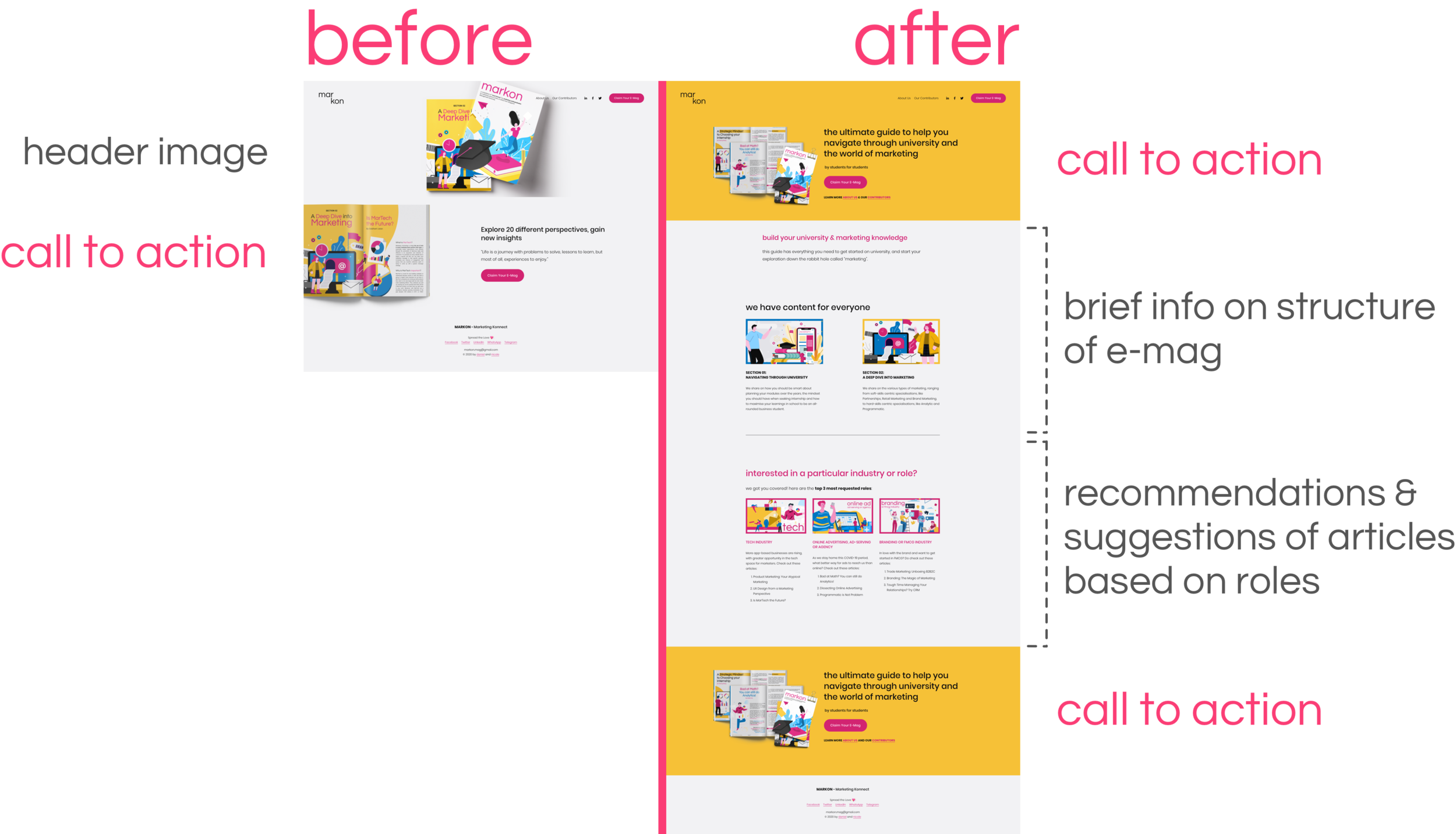
WEBSITE BEFORE AND AFTER • Referenced from the invision blog

We added a visual sequence flow of what to expect in the google form.
With the changes made, we were all set for the launch 🚀, which we did in phases and with the help of some student organisations, because we understand that they would be the freshmen’s first touchpoint!

during this covid-19 period,
our e-magazine seem to fit the context even more, providing an additional outlet and resource for the incoming undergraduates and students who do not know how to look for the relevant mentors or seniors.
We hope markon e-magazine is of value to the readers and we are heartened to hear comments from juniors, and friends of friends asking where was this resource when they were younger, and how it has truly inspired them.
during this process,
Daniel and I never once thought of giving up, despite him still job-searching, and our contributors having some offers retracted, or still job-seeking, that didn’t stop us from continuing this project.
Everyone still went above and beyond to give back because we know it’s very beneficial to share the knowledge we have to benefit others. Despite the current situation, we are in a position of privilege (access to industry experts, gone through university education and internships) and it’s only right we give back.
This is a 100% self-led initiative and we hope to just benefit at least one reader at a time. Daniel and I didn’t even set any goals to hit, but just to have a piece where people at home can read and explore marketing through our eyes.
(And even though we are business student, the answer is no, we do not make money from this.)