
SATS x Design Thinking
first exposure to design thinking

Summary
Through a Design Thinking module, we worked with SATS to improve a travellers’ experience in Changi Airport Terminal 3. It was my first exposure to Design Thinking, and we focused mainly on offline solutions.
project duration
15 weeks (Aug 2017 - Dec 2017)
• problem statement •

How to improve the travellers’ experience in Changi Airport Terminal 3?
– Problem Statement provided by SATS
who is sats?
SATS is the chief ground-handling and in-flight catering service provider at Singapore Changi Airport. SATS controls about 80% of Changi Airport's ground handling and catering business. SATS provides gateway and food services in Asia. (Taken from Wikipedia) 😉

trips to the airport…
shadowing & interviewing

a pair of lovebird tourists 🕊️
“singapore is just lovely!”
Our team took turns over the span of one week to observe what’s the usual passengers’ experience at Terminal 3 due to the broad scope given. We generally focused on arriving passengers, since their time spent in the airport is longer than those who arrived.
We then got our Sherlock Game On! 🕵From there, we then mapped our findings in a User Journey Map.
user journey map
pain points are highlighted in yellow

plane boarding: why these pain points?

We had more pain points in consideration, however, after utilising a decision matrix, we then decided on ‘Messy Boarding’.
We looked at two main areas of consideration:
Overspilling Effect – Does it cause more issues?
Frequency – Is this issue common?
insights
From our further observations at the boarding gate, we noticed the following:
High desire for overhead baggage space 😍– Many passengers have the mindset to get on the plane as quick as possible in order to get enough overhead storage
Varying standards of procedures / regulations
📊
– Across multiple boarding gates, SATS guidelines vary by gates (i.e. the checking of tickets). This process is time-consuming.
Implementation constraints 🚫– SATS are service provider but constrained by their ‘landlord’ Changi Airport Group (CAG), thus making implementation of technology-heavy solutions harder.
When looking at the two pain points (highlighted in yellow), we decided to focus on making passengers’ experience boarding the plane much better, relieving their kiasu mentality.
Focusing on the pain point of “Messy Boarding”, we then did another two observations to gather more insights in order to form our user persona. With that…

meet sharon
our user persona
Sharon is a 40 years old, avid-traveller who check-in early (>3 hours) as she enjoys duty-free shopping before her flight. She values punctuality and is assertive and self-righteous.
Her goal is to find the correct entry, board quickly, and get a good space for her baggage space. During the time of boarding, Sharon is alert, defensive and kiasu*.
*’kiasu’ is a local term to mean ‘fear of losing’
• problem re-defined •

How to improve Sharon’s boarding experience in Changi Airport Terminal 3?
– problem re-defined

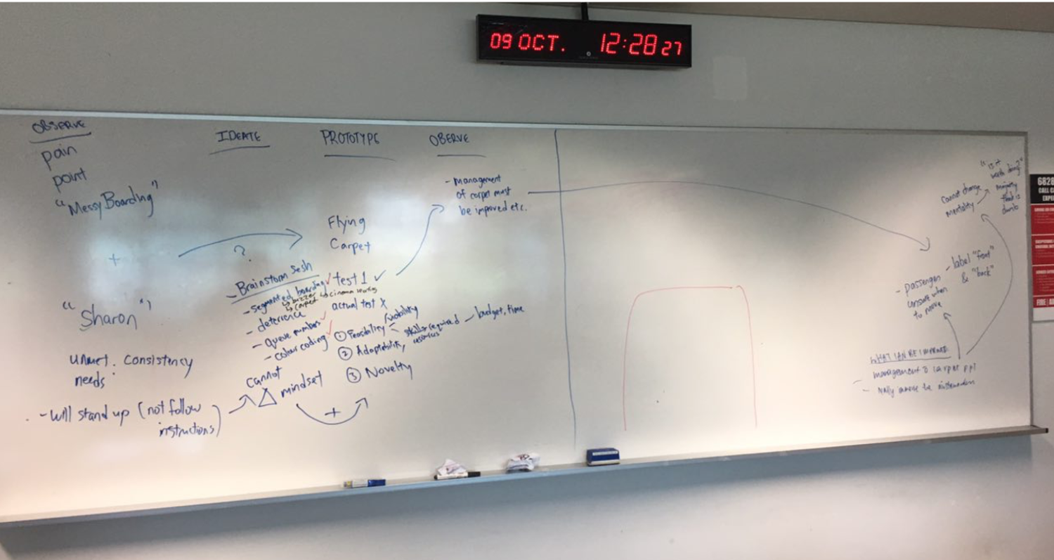
brainstorming 🧠
With my group mates, we brainstormed focusing on:
improving messy boarding 🚶🚶♀️🚶♂️and
lack of overhead space (which was later scrapped)
Using the 2x2 matrix, we focused on:
Analogous vs Tech-heavy solution ↕️
Deterrence vs Encouragement ↔️


prototype #1: “Mighty Mat”
idea
“Mighty Mat” is a mat on the floor, that allows them to roughly know where they are seated, and optimize the steady flow of passengers in the queue when boarding the flight.

The “Mighty mat” idea
conditions
Our proposal to test this out with actual passengers got rejected due to the clients’ fear of impeding on the passengers. As such, we did a dry run in school with 60 participants of seasoned ‘flyers’/passengers, with randomised seating. 💺
We simulated conditions and included users who fit into our “Sharon” persona, assigned families in groups and simulated a plane layout in a classroom. ✈️
We also had a control round as to how passengers would usually board.
This was the test of the “Mighty Mat” outside the “Plane” (which was a classroom).
This was to simulate the inside of the plane and how tight it was. Passengers had to turn three times to simulate time wastage from storing of baggage in the overhead compartments.
results and learnings
We did it across three rounds and took the average, but from what we observed, it took longer. Additionally, users found it unnecessary, inefficient, and complicated. 🥵
Our idea was better in theory than practice. 🧠

results and learnings
We have to re-align to our users’ needs to increase user adoption. There’s no need to overcomplicate current process, and instead we should simplify the process.
we immediately note down the findings…
setbacks = opportunities to improve! 💪

our “mighty mat” prototype ⚙️

our 60+ volunteers 💙

first reiteration: “Mighty Bands”
rationale
Utilised brainstorm idea of wearable for passengers. This would provide easy identification of passengers who are required to board and breaks the language barrier.

coloured wristbands
different segment groups will be issued different colours & colours will be announced
execution
We carried out the testing with an actual flight at 0945am. The constraints we faced on the day itself were that there were multiple flights boarding, so we were unable to tell who exactly is on the flight we are testing for.
Halfway through, we learnt that there are two main gates, front-gate boarding and rear-gate boarding which we didn’t account for in our prototyping phase.

findings
There were six main findings:
Infringe on passengers’ privacy 😒– Some passengers do not like the idea they had to wear something. They rather be left alone.
Language barrier 🗣️– The flights we’ve been testing with was TO China 🇨🇳and we found ourselves having to explain
Colour Clash 🎨– Singapore Airlines (the flight we tested with) already has their own colour segmentation (i.e. Blue for Business Class, and Green for Economy Class.)
Ineffective usage of wristbands – Most passengers do not flash up to show the staff and thus, ineffective
Announcements were unclear 🔊– Additionally, passengers were not listening due to their own personal activities (i.e. Listening to Spotify, etc.)
Need to have more intuitive prototype – However, existing visuals aids are insufficient…

From here, we then focused on creating a prototype that addresses the issues above, especially on the lack of visual aids.
second reiteration” Mighty Boards”
rationale
We tested the placement of dynamic display of boarding information around the boarding gate along with its functionality.

FROM IDEA TO PROTOTYPE!
execution
We held up A1 boards during the boarding of the Economy class passengers. We pasted on ”Boarding 现在登机” status beside gate number when it is time for group to board. We had 6 boards spread out throughout the boarding gate.
![[gif] pREVIEW OF HOW WE CARRIED OUT OUR TESTING](https://images.squarespace-cdn.com/content/v1/5dcbda70786ea45cda1b2ed9/1589889254708-ADA0FOO31BHZD0PA3BOS/ezgif-3-49d7cbdbf036.gif)
[gif] pREVIEW OF HOW WE CARRIED OUT OUR TESTING
findings
There was a lack of information for passengers, and the location of our boards were not optimal. Additionally, we only catered to the Economy class passengers.
From here we have the following possible improvements:
Specific placement of screens – e.g. at the charging stations or beside the seats
Display on the screen (short-term)
Boarding for all groups of passengers
Display more information (i.e. gate number, group number, various language, etc.)
Automate the process of screen display (long-term)
Link the screens to ticket scanners to show progress of boarding (e.g. 75% boarded)
Live updates of boarding process by showing different status for different segments (e.g. waiting, boarding now, boarded)

the three improvements we hoped to have tried out.

This was my very first project on Design Thinking and my very first project in school, where I had to work with a client. Through this, I realised the importance of having multiple disciplines in a team because a greater variety of ideas would present itself.

my main takeaway: never stop improving
thankful for this group of seniors who are so forgiving to this sophomore 😌
(they really let me do anything)
There can always be something to improve on and there will never be a perfect product. Given the time and resources, I’m thankful my team and I managed to achieve this much.