
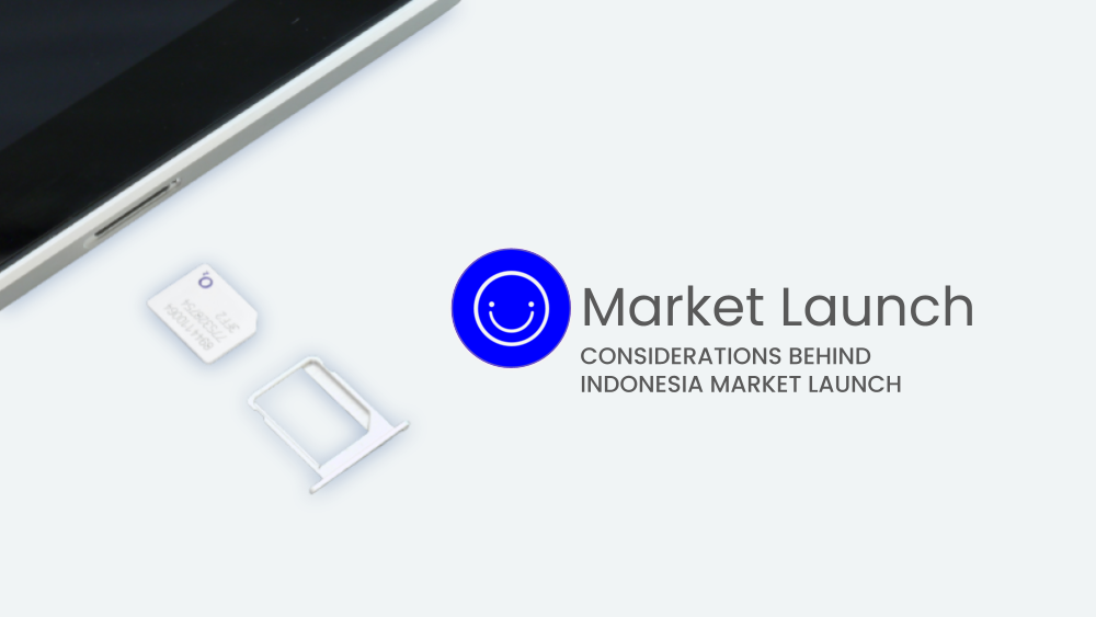
New Market Launch
Due to an NDA, some information has been stripped down.
If you would like to learn more, feel free to contact me for further discussion.
Introduction
Circles.Life is a telecommunications company that started in Singapore, and slowly expanded into multiple markets.
A team has been tasked to modularise components to simplify potential market launches. This was done due to the difficulties encountered during the launches in Australia and Taiwan, and in preparation for a new market launch – Indonesia.
I was the primary UX designer attached to the team. This sharing focuses more on the research and consideration required.
Research
know the rules
The team recognized that regulations vary by market and that documentation verification checks were required for purchasing a SIM card in Australia. Therefore, understanding regulations and preparing for potential hurdles was crucial.
know the audience
Similarly, understanding customer behavior was also important, even though the primary market knowledge was based in Singapore. The team recognised that sign-up structures from telco competitors in Taiwan and Australia were different and took into consideration what was familiar to customers in these markets.
Approach
To efficiently scale, the idea of building a library of fundamental components for new market launches was introduced. A modular approach allows for potential savings in time and resources while maintaining a consistent brand and user experience.
The team prioritised function over design and created a Lego-like modular approach to ensure a solid foundation for the project, making it easier for engineering to produce necessary components and adapt to customer needs and market changes.
Entering Indonesia market
In conjunction with the preliminary work, the team was preparing to launch their product in Indonesia, which they face a new set of challenges. Unlike other markets they've entered, the Indonesia telco market is predominantly pre-paid, which presents a shift in the company's usual focus on post-paid offerings. Additionally, there are differences in payment methods and the length of language, which require the team to rethink their approach to localisation.
Pre-paid market and payment method
Pre-paid market
The Indonesia telco market is predominantly pre-paid, which presents a shift in the company's usual focus on post-paid offerings. Over 90% of Indonesian mobile phone users are on pre-paid plans, with post-paid plans making up just a small fraction of the market. This is in contrast to many other markets around the world where post-paid plans are more prevalent. Companies looking to expand into Indonesia's telco market need to adapt to local market conditions to cater to Indonesia's preference for pre-paid options.
payment method
One of the key differences between the Indonesia and Singapore markets when it comes to phone bills is the payment method. In Singapore, post-paid plans are the norm, and customers are typically billed at the end of each month for the services they have used. This is usually done through automatic deductions from a credit or debit card, or via a bank transfer. In contrast, pre-paid plans are much more popular in Indonesia, and customers typically pay upfront for a set amount of data or talk time. This payment is usually made in cash at one of the many convenience stores or street vendors that offer mobile top-up services. This presents a challenge for companies looking to enter the Indonesian market, as they may need to adapt their billing and payment systems to accommodate this unique payment method.
Language
When it comes to language in UI design, it's important to consider the local language and dialects spoken in the target market. In the case of Indonesia, the official language is Bahasa Indonesia, which is spoken by the majority of the population. However, there are also several regional languages and dialects that are widely used, such as Javanese, Sundanese, and Balinese.
This means that UI design for the Indonesian market needs to take into account the use of appropriate language and dialects that are familiar and easily understood by the target audience. It's also important to consider the length of the language used, as some languages may require more characters to convey the same message, which could impact the overall design and layout of the UI.
specifically for this launch
The team focused on Bahasa Indonesia for the pilot and worked closely with the local team based in Indonesia. However, one key challenge was the length of the text used in Bahasa Indonesia compared to English. The length of Bahasa Indonesia text for certain actions was longer than the English equivalent, which posed a challenge when designing UI elements such as buttons.

difference in the copy length for the various markets
Difference in length of copy can pose a challenge when designing UI elements such as buttons and CTAs, as the longer text may not fit well within the design, or may require smaller font sizes that could impact readability.
Conclusion
My experience supporting the preliminary research for the Indonesia market launch taught me valuable lessons that can be applied to future market launches. It's crucial to understand local market regulations and purchase behaviours, design modular components that can be easily adapted for different markets, and localize the UI design to communicate effectively with the target audience. Despite the challenges that may arise, working with local experts and conducting user testing can help overcome these obstacles.
If you're interested in learning more about market launches or have any questions, please don't hesitate to reach out to me. I'd be happy to share my insights and experiences with you!